
Digital branding
The Conference for Consciousness & Human Evolution (TCCHE) is a spiritual events organisation which wanted to create a new look and feel for their brand. Below is the journey of evolving the design language and identity for TCCHE.
Vertical & Horizontal Logo Lockup
The vertical logo lockup will be used where we have the luxury of space. The horizontal logo lockup will be used where we have limited vertical space and more horizontal space. Colour and black & white variations are shown below,. The tagline; Explore, Expand, Evolve encapsulates the essence of growth and self-discovery in the realm of meditation and mindfulness.
TCCHE Colour & Grain
Noise and Grain typically refer to a texture or pattern that resembles the irregular, granular appearance of natural materials like wood, paper, or stone. In digital design, grain is often added artificially to evoke a sense of tactility or authenticity, especially in photography or illustration. The colours represent the rainbow colours from the TCCHE circle. These colour gradients are used creatively as different corners or across the background.
TCCHE Shape
The circle icon used in the primary logo symbolises the company mission to ignite a passion for spiritual growth. The intricate design of the TCCHE logo enables us to extract various shapes, which can be utilised as design elements to further enrich the TCCHE identity within layouts aesthetically.


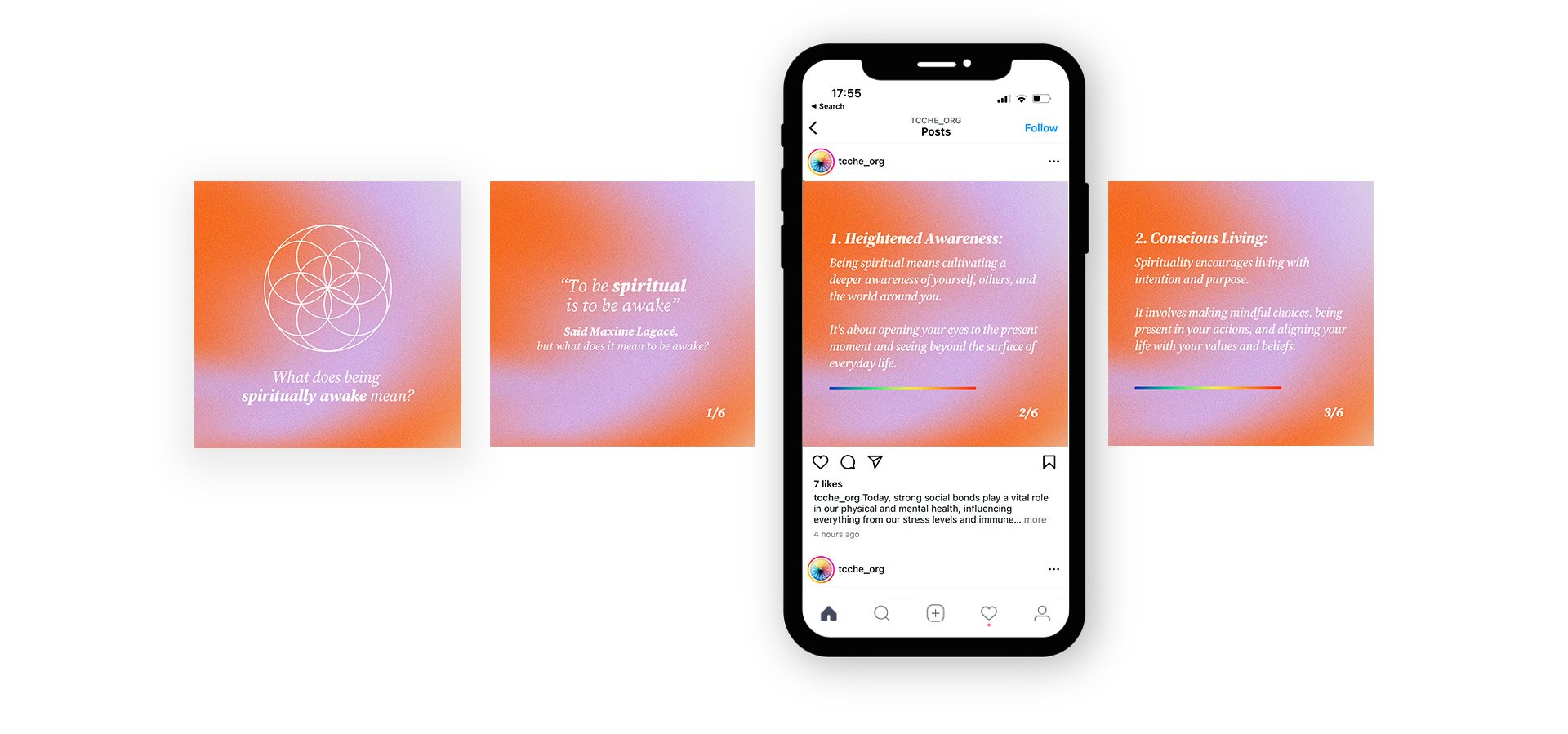
Social Media Template Design
The social media design was to show a check board effect with bright colour gradients and minimal white text designs.